– “Liquid Glass” design overhaul with adjustable transparency, new sidebar, colorful icons, and up to 30% faster app startup.
– Siri AI chatbot replaces standard Siri, offering natural language answers, screen access, and app control.
– AI-powered Safari can generate custom browser extensions from user prompts.
– System-wide AI Writing Tools and Image Playground for generating/editing text and images.
– Photo AI features include expanding images (AI-generated zoom-out) and “Spatial Reframing” to change perspective.
Major macOS 27 Update Unveiled
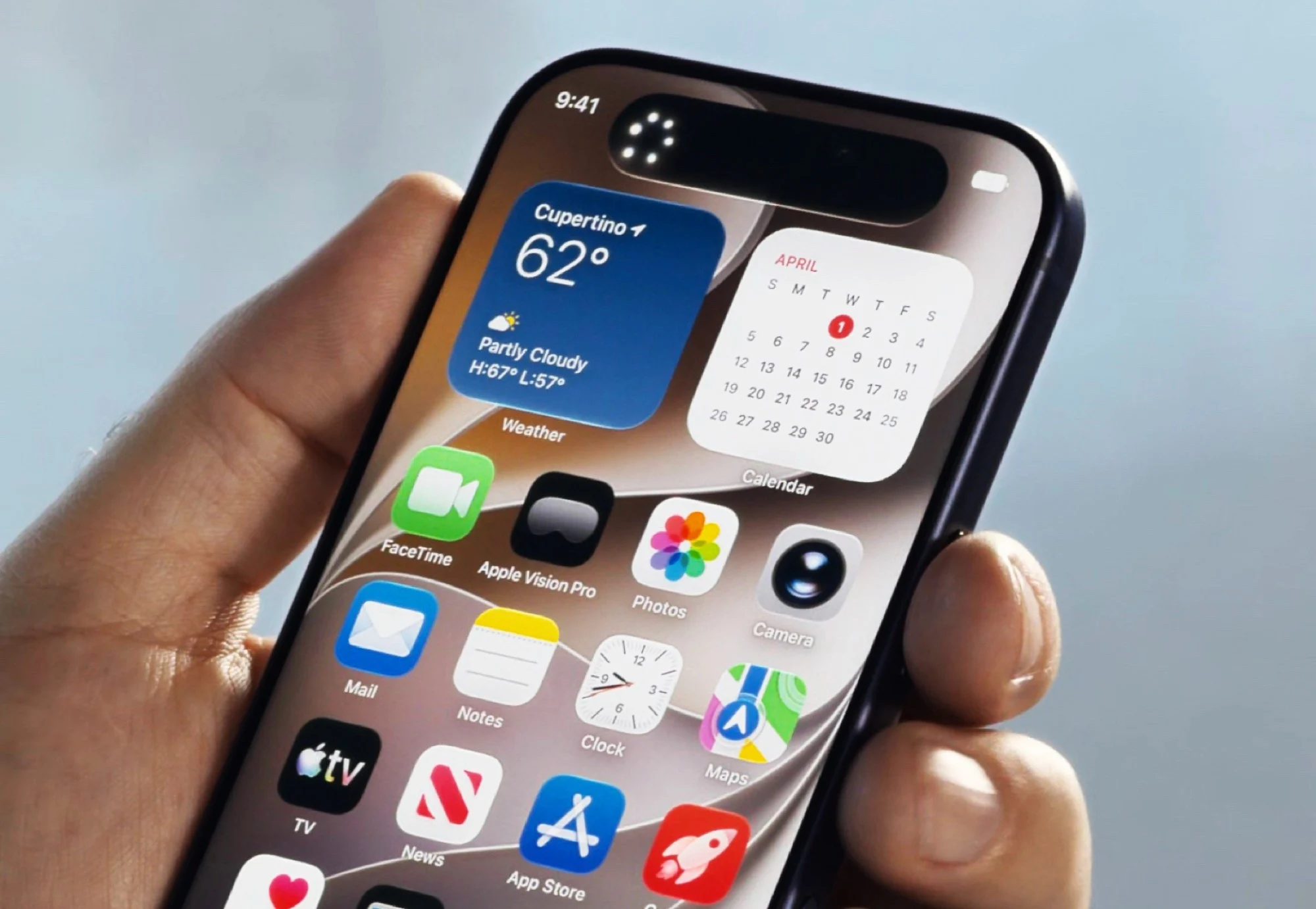
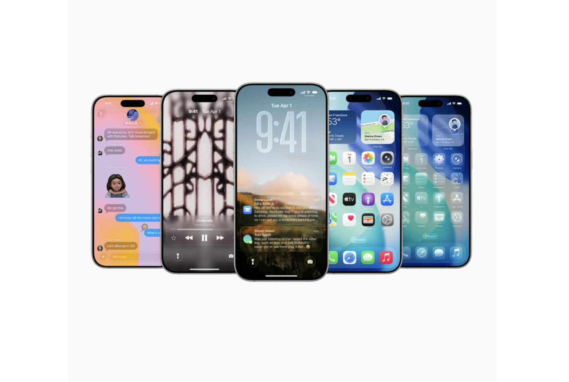
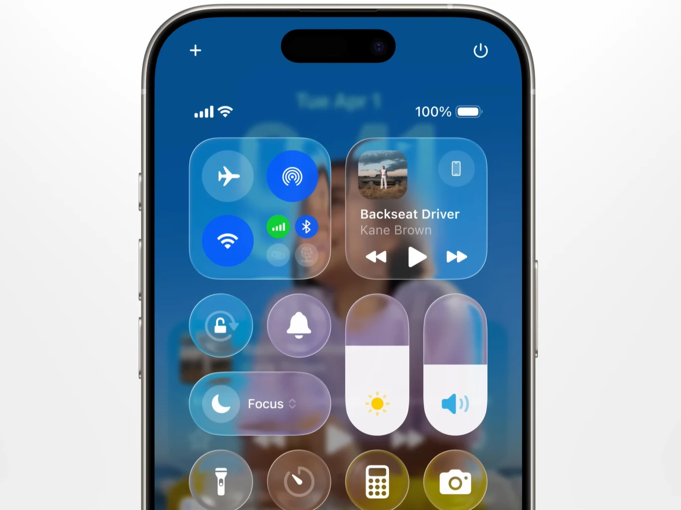
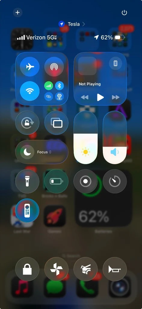
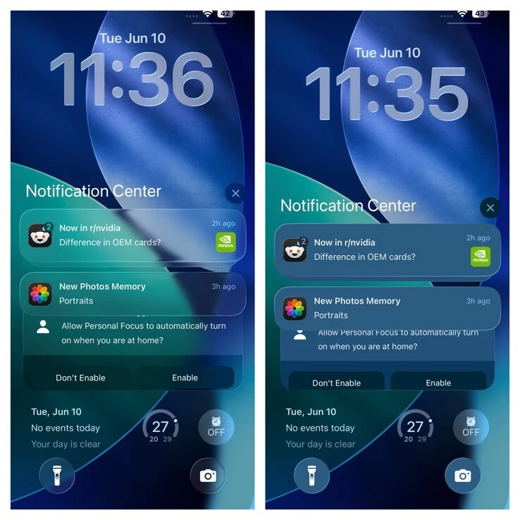
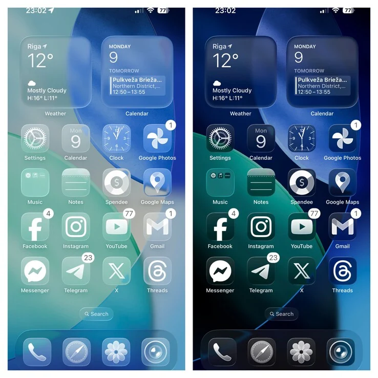
With macOS 27, Apple today unveiled the next major operating system update for the Mac. The system receives many of the new features that are also coming to the iPhone with iOS 27, starting with an optimized “Liquid Glass” design that allows users to adjust how transparent the “glass” actually looks in the system settings.
Visual and Performance Tweeks
The sidebar on macOS now has a sloping edge, app icons are more colorful and the corner radius of windows has been standardized. Thanks to these adjustments and improved app icons, Liquid Glass should look better than ever and apps should start up to 30 percent faster by preloading parts of the code into the RAM. AirDrop can transfer data up to 80 percent faster after the update.
AI Highlights and Siri Replacement
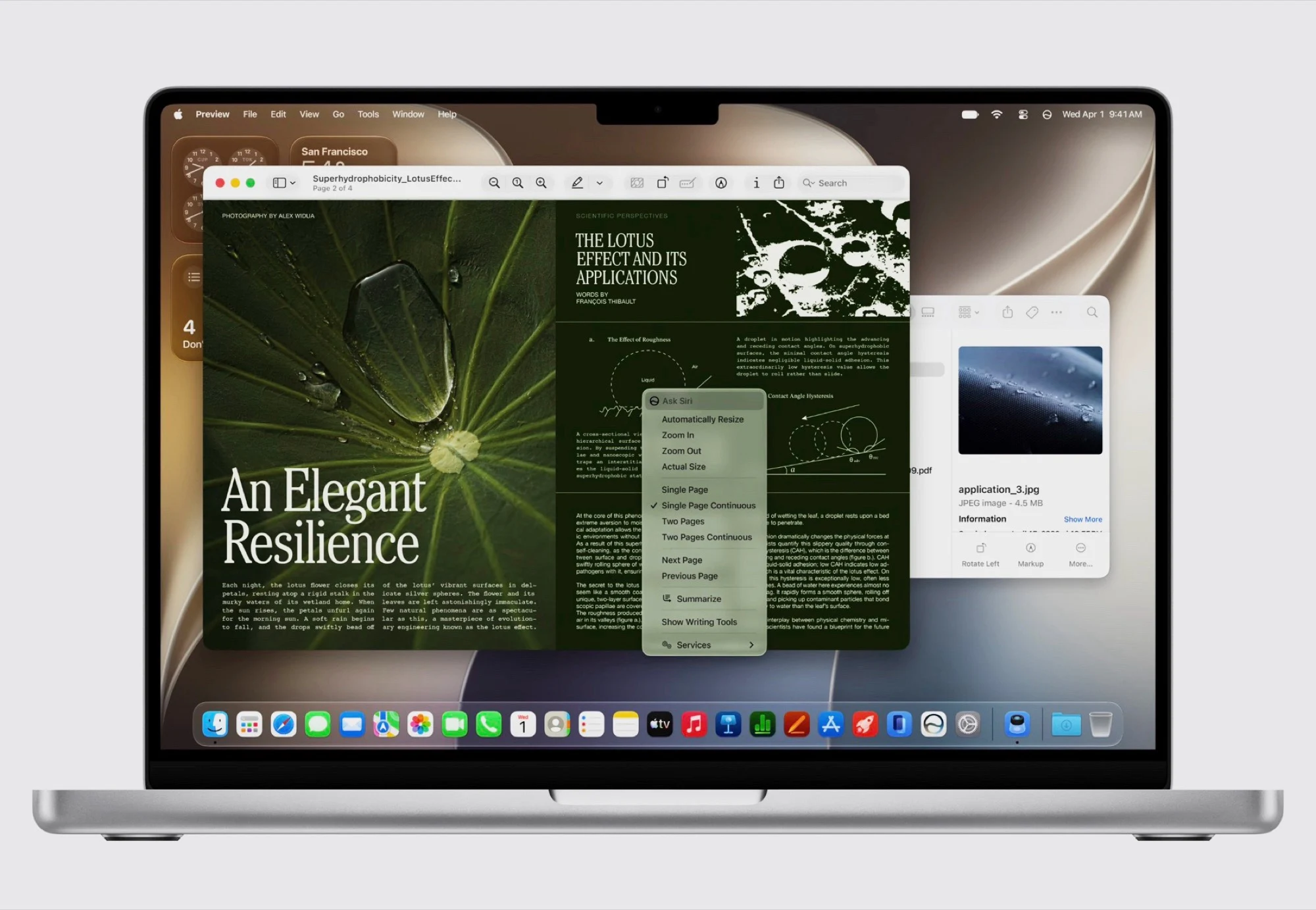
In addition to the performance and design optimizations, the new AI features are the highlight of macOS 27 Golden Gate. The biggest innovation is Siri AI, Apple’s brand new AI chatbot, which replaces Siri as the voice assistant. Siri can either be used in the new Siri app or accessed directly via Spotlight.
Siri AI gives answers in natural language, similar to ChatGPT. A special feature is that Siri AI can access the screen and open apps so that, for example, questions about a text or image can be answered on the screen or apps can be controlled. Apple Intelligence also receives innovations in other areas of the operating system
Home, Safari, and Writing Tools
For example, the Home app can now recognize objects via HomeKit cameras so that users can be notified when a package is delivered. Apple’s Safari web browser in macOS 27 can not only group tabs using AI, but can even generate browser extensions based on a prompt, for example to be notified when a new article is published.
Apple’s Writing Tools are now available system-wide to generate or rewrite texts. Image Playground can now generate images using artificial intelligence, either in a realistic style or based on a photo. Generated images can be further edited using prompts.
New Photo Editing Capabilities
Apple also introduces numerous AI features for editing captured photos. Photos can be expanded in macOS 27 and iOS 27 so that they can be “zoomed out”, so to speak, and the missing pixels are generated. A feature called “Spatial Reframing” can subsequently change the perspective of a photo, ultimately generating a completely new image.