
Key Takeaways
1. YouTube is testing a major redesign of its web video player after receiving user feedback on earlier changes.
2. The new layout features a cleaner and more unified design, with familiar controls returned to their original positions.
3. Key features like the volume slider are back next to the play/pause button, while other controls are grouped in a pill-shaped container.
4. Some elements, such as the skip button and mini player toggle, have been removed in this redesign.
5. The new design is currently not widely available, as it is still in testing, and there is no guarantee it will be fully rolled out.
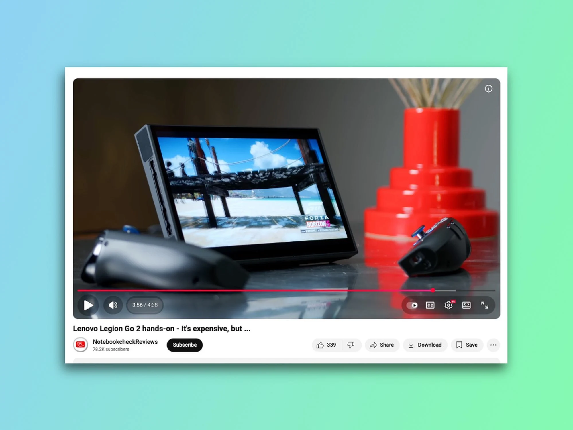
YouTube is once again changing the way its web video player looks. Since April, the company has been working on a major redesign, and after making several adjustments, the new version is now appearing for some users. The good news is that it seems YouTube has taken some of the early criticism to heart. I saw the new design on my main YouTube account this past weekend, and here’s how it appears.
A Better Layout
The previous redesign moved around familiar controls and placed them in floating bubbles. Users were not happy about this, especially with the volume slider being pushed to the far right corner. Now, five months later, YouTube is testing a more polished design that feels cleaner and more unified, giving it a distinct Apple Liquid Glass appearance. Here’s how it stacks up against the old user interface.
Returning Features
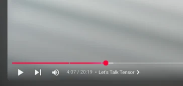
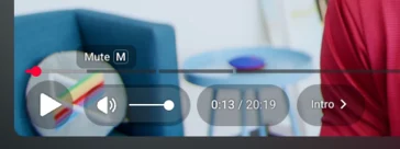
The volume slider is back in its rightful place—right next to the play/pause button, and you can still use the up and down keys to change the volume. Other UI components, like timestamps and chapter markers, remain on the left in their designated bubbles. Meanwhile, autoplay, subtitles/captions, settings, theatre mode, and fullscreen controls are now bundled together in a pill-shaped container on the bottom right. I didn’t get to try the previous UI myself, but from what I’ve seen in pictures, the new interface appears to be slightly more see-through. The pills also display a thin black outline when you hover over them, which helps indicate where you’re clicking.
Missing Elements
However, not everything made it through this second round. The skip button is no longer available, and the mini player toggle on the right side has vanished as well. While I hardly ever used the skip button, it’s clear that some users will have strong feelings about its removal.
I noticed the redesigned video player on my main account, but it’s absent on my secondary account and when I access YouTube in incognito mode. Some Reddit users have mentioned they can see it too, but it doesn’t seem to be widely available at this point. Google is well-known for A/B testing UI updates and features that might never be fully released, and there’s no certainty that this YouTube UI redesign will avoid the same fate (remember the “Related Videos” redesign that got scrapped after backlash?). Still, considering it has been under testing for nearly a year and Google is clearly acting on early feedback, there’s a decent chance this UI could get a wider rollout.
YouTube faced a lot of criticism when it first revealed this redesign back in April, but I genuinely appreciate this more polished version. It feels more modern and cleaner, and I honestly wouldn’t mind if YouTube rolled this design out to everyone. The desktop player has remained largely unchanged for years, so it’s about time it got a refresh.
Source:
Link
Leave a Reply