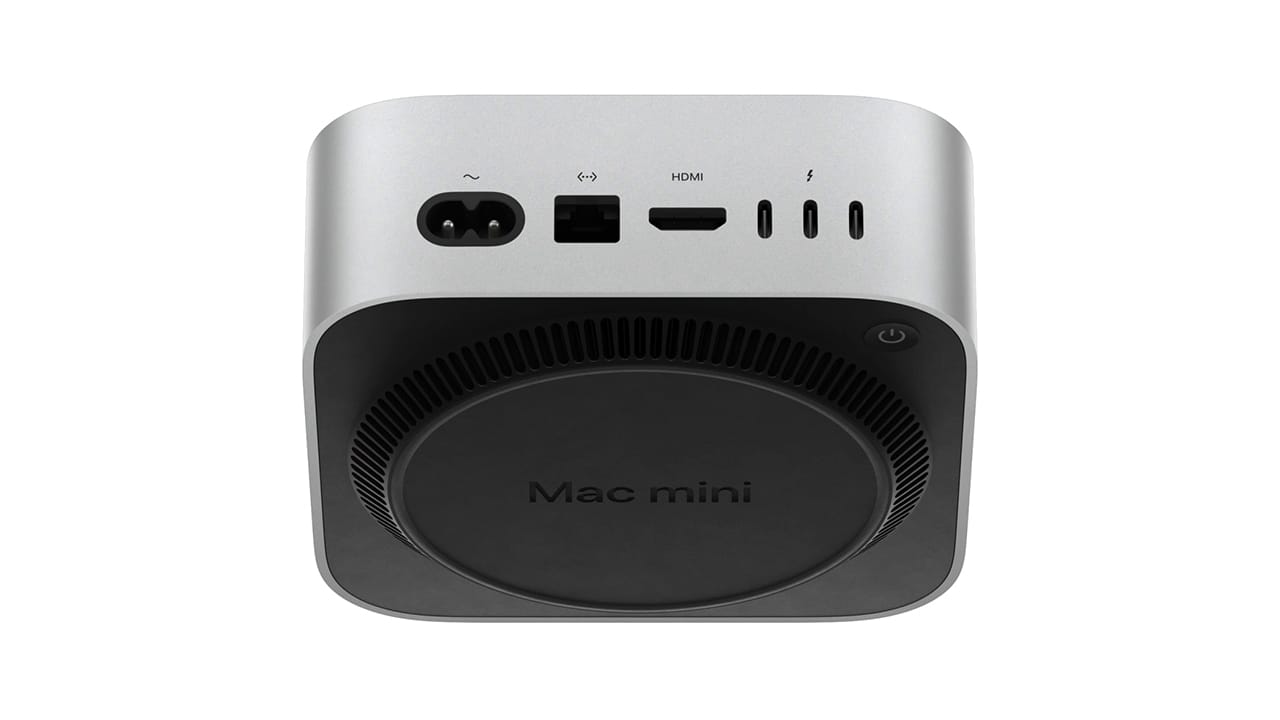
Apple has introduced the 2024 Mac mini, which comes with enhanced hardware and can be equipped with up to the M4 Pro chip. In addition to better performance, this new mini PC is also more compact than the previous model, boasting a footprint that’s less than 50% of its forerunner. One notable design change is the placement of the power button at the bottom, which has stirred some discussion.
Design Decisions Explained
In a recent interview, Apple’s senior vice presidents, Greg Joswiak and John Ternus, discussed the reasoning behind moving the power button. They mentioned that the smaller size of the new Mac mini necessitated finding an optimal position for the button, leading to the choice of placing it at the bottom.
User Experience Considerations
Some initial feedback regarding the design noted that pushing the relocated power button could be inconvenient when the device is sitting on a table. However, the two executives pointed out that users rarely need to use the power button. This is another justification for its bottom placement on the 2024 Mac mini.
Most users typically keep their Mac devices powered on, opting for sleep mode instead. Therefore, the power button is mainly used for force restarts or shutdowns. According to the Apple vice presidents, accessing the button in these situations is simple; you just have to “tuck your finger in there.” The weight of the top-tier model is also quite manageable, at only 1.6 lbs (approximately 0.72 kg), making it easy to lift.
Potential Installation Issues
Nevertheless, having the power button on the bottom could pose challenges when the 2024 Mac mini is installed behind a monitor or TV, such as the AOC CQ27G3Z gaming monitor, which is currently priced at $249.99 on Amazon. The vice presidents did not address this scenario, suggesting that Apple might not have considered this particular setup when designing the new model.


Leave a Reply