
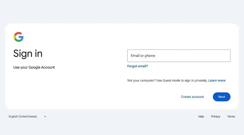
Google has recently unveiled a refreshed look for its sign-in and sign-up pages. While not a drastic overhaul, the subtle changes are a pleasant update for frequent Google service users. The new design aims to streamline the visual aspects without altering the functionality, aligning with Google's commitment to maintaining a modern appearance.
Material Design Continuity
The updated sign-in page now aligns more closely with Google's 'Material Design' UI, which was initially introduced back in 2014. This design refresh ensures that the page adapts better to various screen sizes, catering to both computer users and those accessing Google services on their mobile devices. However, users with outdated browsers may not immediately see the new design elements.
Evolution of Sign-In Pages
In 2015, Google made a significant change by introducing a two-page sign-in process, prompting users to enter their passwords on a separate page. This adjustment was made in preparation for alternative login methods that might not require a password, as well as to simplify the experience for individuals managing multiple Google accounts.
Continuous Improvement for Users
Google affirms that this updated design is a permanent change, reminiscent of the transition when Gmail was revamped to consolidate all content into a single view. The rollout of the new sign-in page commenced on February 21, with the goal of making it accessible to all users by March 4, 2024. Despite its seemingly minor nature, this update underscores Google's dedication to enhancing user experiences through incremental design enhancements.
By enhancing the visual clarity and adaptability of the design across different devices, Google aims to ensure a seamless and enjoyable experience for all users, underscoring their commitment to user-centric improvements.
Leave a Reply