
Key Takeaways
1. Initial Concept: Mirror’s Edge was originally designed with a dark, brown dystopian city vibe, similar to other Unreal Engine games of that time.
2. Motion Sickness Issue: Early testers experienced motion sickness due to the detailed environments, prompting the team to simplify the design for better gameplay experience.
3. Artistic Direction Change: The final artistic style emerged from the need to address motion sickness, leading to a cleaner, less detailed world with vibrant colors and large open spaces.
4. Unique Identity: The development team aimed to create a distinctive visual identity for Mirror’s Edge, ensuring that players could recognize it at a glance in magazines.
5. Legacy and Influence: Released in 2008, Mirror’s Edge sold over 2.5 million copies and inspired parkour gameplay in other games, despite its sequel, Mirror’s Edge Catalyst, facing criticism for its repetitive storyline.
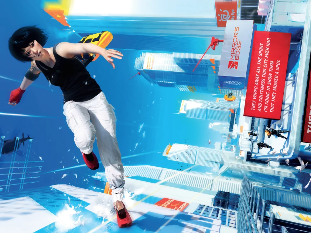
The creators of the well-known parkour game released in 2008, Mirror’s Edge, recently talked with Design Room about the game’s original idea. While we are used to the game’s clean white look, with red markers showing where to go, the first concept was quite different.
Change in Direction
At first, Mirror’s Edge was designed to have a dark, brown, dystopian city vibe, similar to many Unreal Engine games from that era. However, the developers had to abandon this plan because the fast movements and parkour features made them feel very nauseous, much like how players feel when using a VR headset to play Mirror’s Edge.
Senior producer Owen O’Brien mentioned that the first design made players feel sick quickly, which led the team to create a more simplified, less detailed yet beautiful world that helped reduce motion sickness, ultimately giving Mirror’s Edge its bright and appealing look, which people still admire today.
A Necessity for Change
The main artistic design of Mirror’s Edge came from a need rather than just artistic intent. O’Brien shared in the interview, “Mirror’s Edge started off looking like every other Unreal game, to be honest.”
Problems arose when early testers raced through detailed settings, causing a disconnect between what they saw on the screen and what their bodies expected.
O’Brien added, “We found that when you were moving very fast through the world, you got motion sickness very quickly. We discovered that it was less if you made the world cleaner and less detailed.”
Prototype Reflections
Art director Johannes Söderqvist also shared his thoughts, calling the prototype “pretty brown, like a regular game, if you will. It wasn’t bad; it looked good, actually. But there was no style to it, or a fairly generic style.”
Seeing the motion sickness problem alongside the standard seventh-generation console art style, O’Brien encouraged the team to explore new artistic ideas to make the game unique. He recalled, “I said to the team, I want to look at a screenshot of Mirror’s Edge in a magazine and know it’s our game.”
So, Söderqvist and the design team started playing around with textures, removing colors to create large, open spaces, which were highlighted by flashes of bold greens, blues, reds, and yellows throughout the levels.
Reception and Legacy
Mirror’s Edge was launched for the PlayStation 3 and Xbox 360 in 2008, selling over 2.5 million copies. It received praise for its unique gameplay and world design, though the story was seen as lacking.
In 2016, the game was rebooted as Mirror’s Edge Catalyst. It improved on the open-world design but didn’t add much more to engage players, and the repetitive storyline hurt sales. Nonetheless, it did inspire parkour gameplay in titles like Dying Light.
Source:
Link