
Nothing has broadened its audio product lineup by introducing the new Nothing Ear (open) TWS earphones yesterday. Additionally, the company is focusing on incorporating AI into its operating system, along with enhancing performance and making some visual updates.
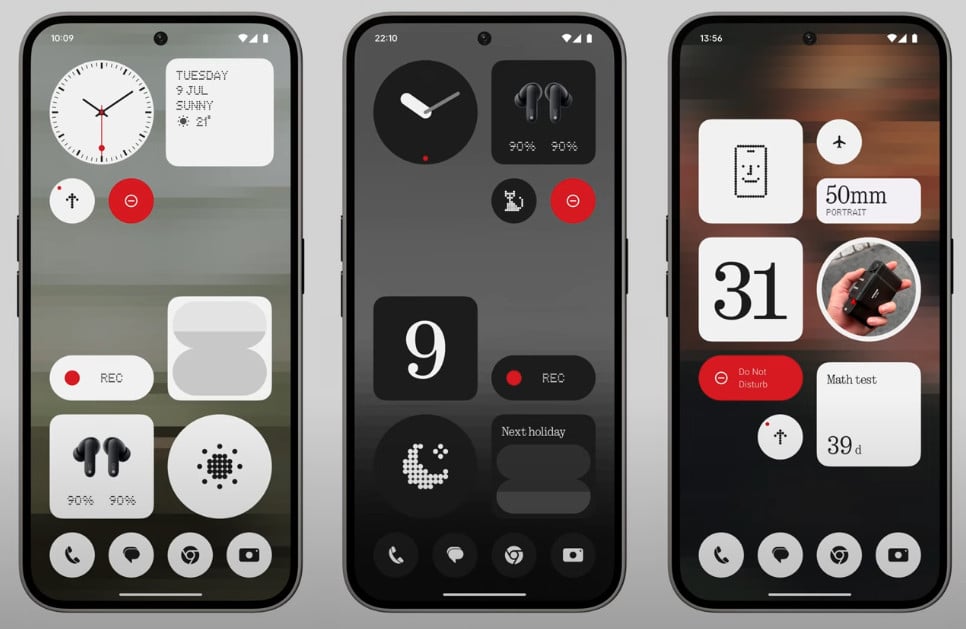
Nothing OS 3.0 Redesigned Widgets
Carl Pei, the founder of Nothing, along with Yuri Levin, the Software Product Design Lead, presented the features of the forthcoming Nothing OS 3.0 on the company’s YouTube channel. This comes after a teaser for the new operating system that was released earlier this year.
Key Improvements in Nothing OS 3.0
Nothing OS 3.0 will introduce a variety of enhancements, including a redesign of the Android skin and the long-awaited launch of a first-party “Nothing Gallery” app. Managing a multitude of apps can be overwhelming, especially when scrolling through a large array of app icons. To address this issue, Nothing OS 3.0 will allow users to pin their favorite apps at the top for easier access.
Moreover, Nothing is enhancing the Smart Drawer App with AI capabilities. This feature sorts your apps into various categories. Although this seems like a familiar function, Nothing asserts that the AI will analyze your app usage data to present the most relevant apps at the optimal time. A new countdown widget has also been added to help users manage their time effectively.
Visual Refinements and New Features
The visual updates include a more polished design with revamped elements such as the Quick Settings panel and the lock screen clock. The auto-brightness feature is now incorporated into the brightness slider button. Additionally, a new dot animation has been introduced, utilizing a new animation engine for smoother and more dynamic visual effects across the operating system, including animations for fingerprint recognition and charging.
Furthermore, the weather icon in the Weather app has been redesigned with a dot matrix style, aligning better with the overall aesthetic of the user interface.

Leave a Reply